La Crisis
de los 20's

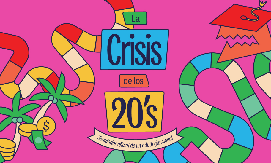
The brief was to design a board game for people, mainly in their twenties, who long to explore the different life paths ahead of them and all the decisions those paths involve.
The main challenge was to create a dynamic identity that would remain coherent across the project's many complex elements, while finding a fun, irreverent tone through illustration and typography.
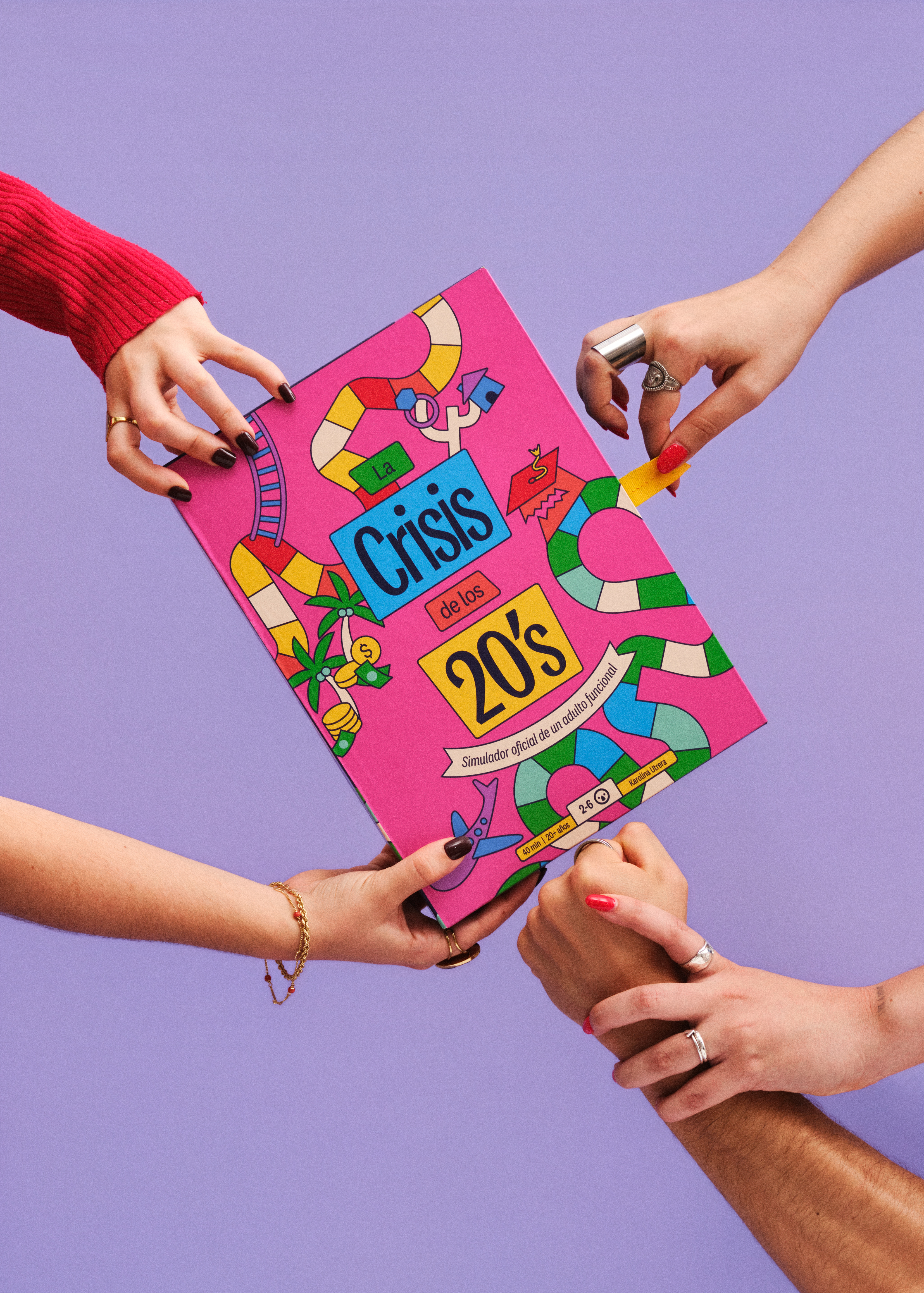
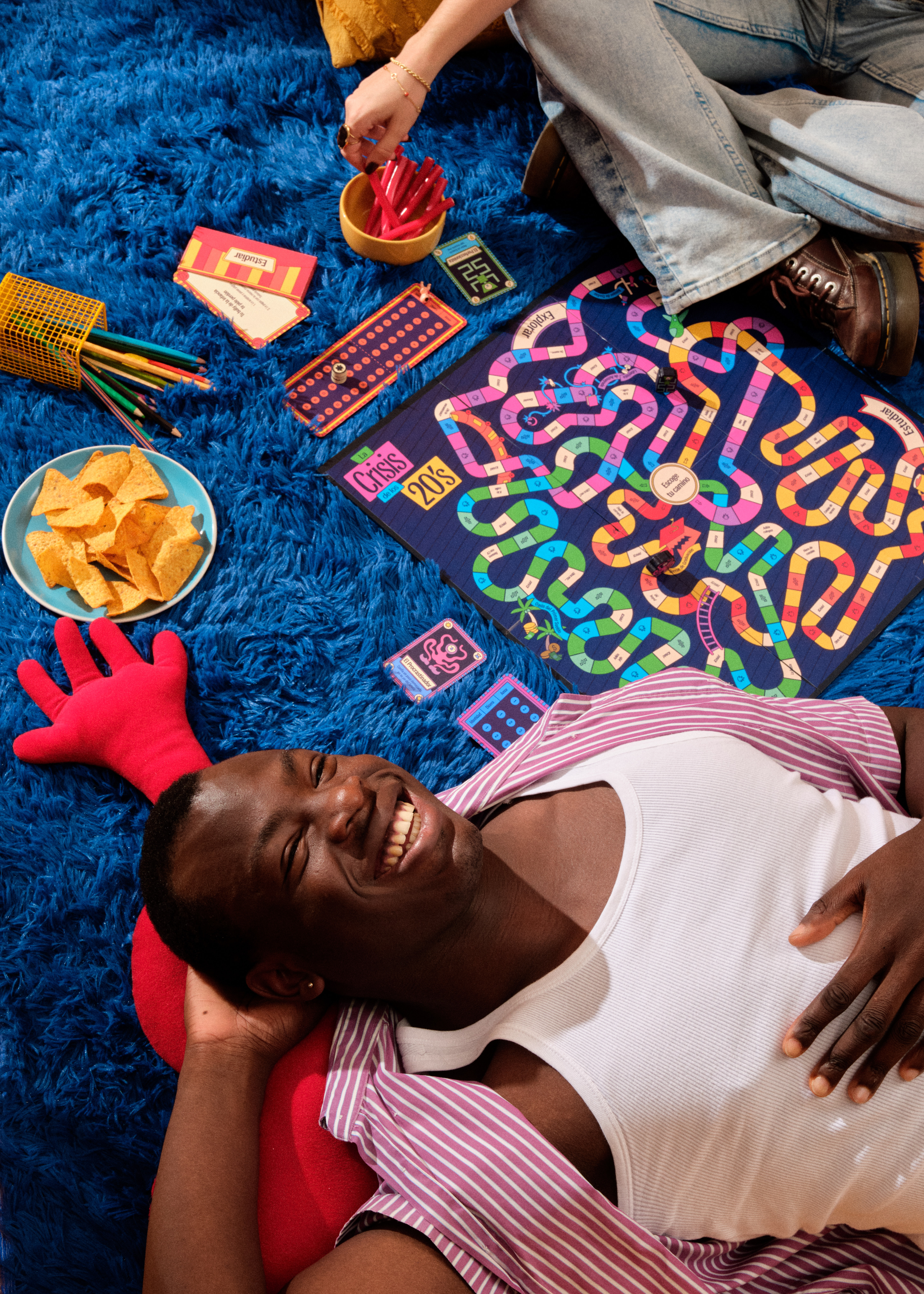
This project was born from all the fears, doubts, what-ifs, missed opportunities, and regrets I've faced since becoming an adult (legally speaking, at least).
Growing up in a generation shaped by economic crises, migration, dictatorships, pandemics, wars, and techno-feudalism, I've realized I'm not the only twenty-something struggling to understand where I am and where I want to go in the chaos ahead. We're surrounded by decisions that feel final, constantly comparing ourselves to people who seem to have it all figured out while we're still working out who we are, what we want, and what "doing it right" even means.
So, for my graduation project, I designed a board game as a way to explore the different lives we could choose to live, in the best way I could think of: having fun with the people we love.
How do you represent how uncomfortable, traumatic, and inevitable growing up is? This project answers with disproportion, controlled chaos, and color play as the pillars of its visual identity.
While we grow, our bodies are out of proportion, with one ear bigger than the other or hands too large for our arms, until we even out and find our balance in adulthood. The design builds on that disproportion, which also echoes the imbalance and change a crisis brings. It runs from the illustration style to the typography, with varying weights and shapes that stretch and coil around themselves, giving the identity a youthful, playful, lighthearted tone that connects with the audience and with the awkwardness of facing a life crisis.
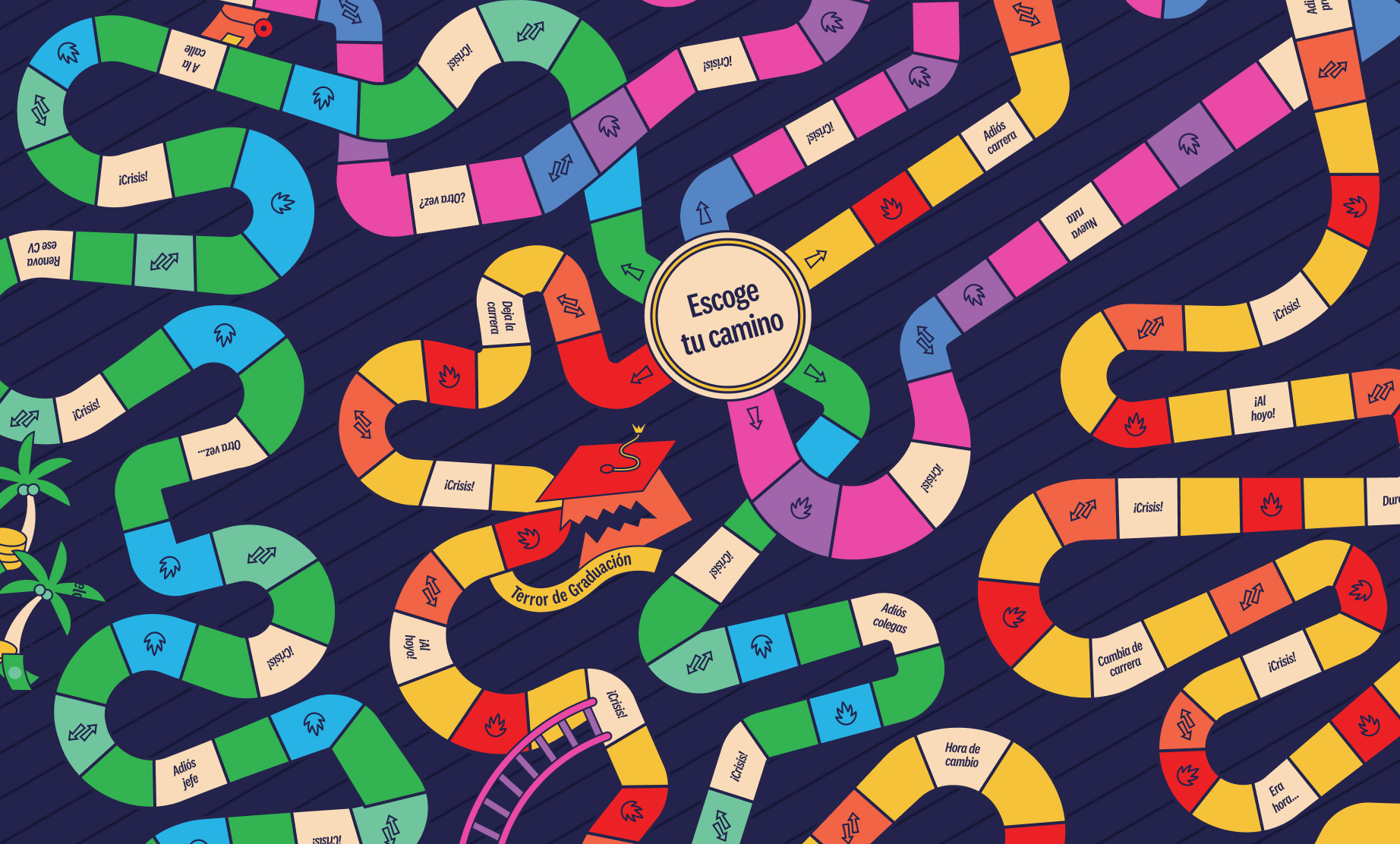
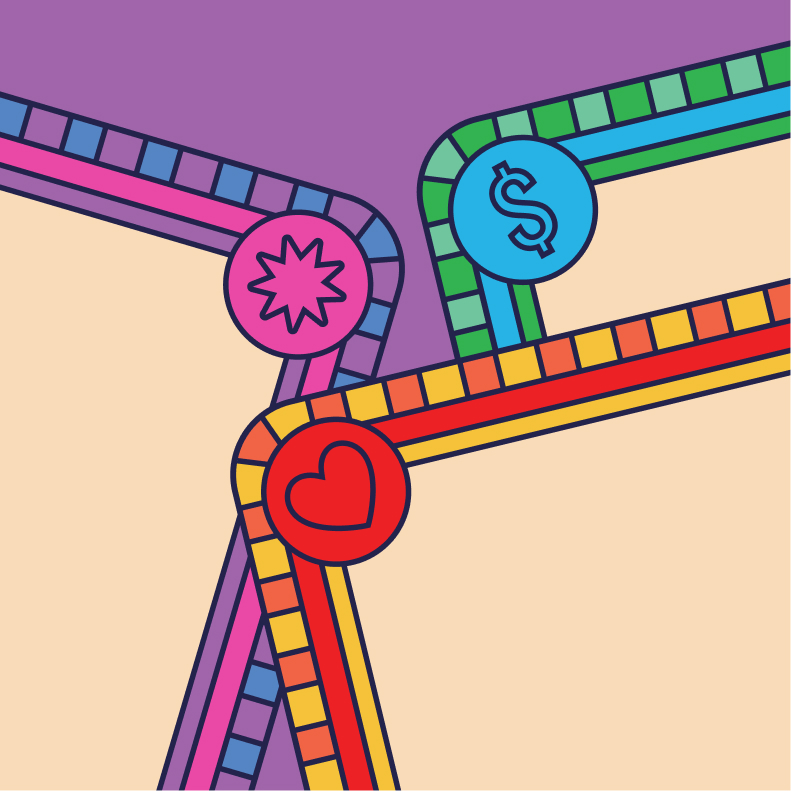
The same disproportion shapes the board, whose paths have no beginning or end and cross one another at multiple points. This chaos mirrors real life, where we jump from one path to another and never know where we'll end up next.
Meet the Twenties,
your alteregos.
These are the archetypes players can see themselves in. Each has its own traits, strengths, and weaknesses, along with a set of unique elements that tell its story and come through in its illustration.
The Childish One still depends on their parents, so their card shows the symbols of a stable economy (their parents'). The Old Soul, worn down by early responsibilities, has dark circles and a scale. The Perfectionist won't decide unless success is guaranteed, hence the reinforced symbols of fortune and failure.
The Procrastinator leaves everything to their future self, with a star for optimism and a clock for waiting. The Lost One could choose any path and freezes, surrounded by arrows pointing in every direction. The Chameleon follows everyone else, marked by elements of change and transformation.
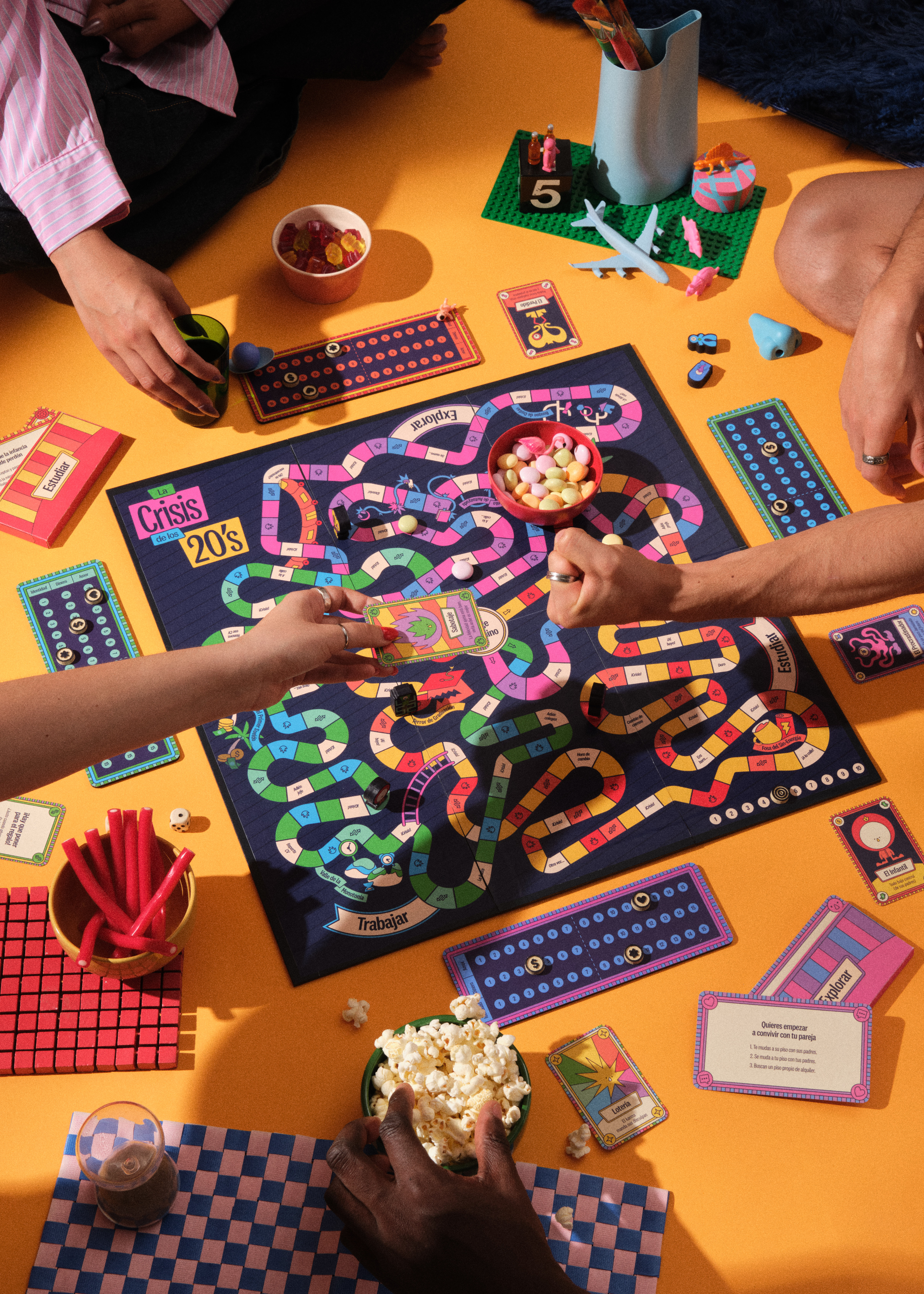
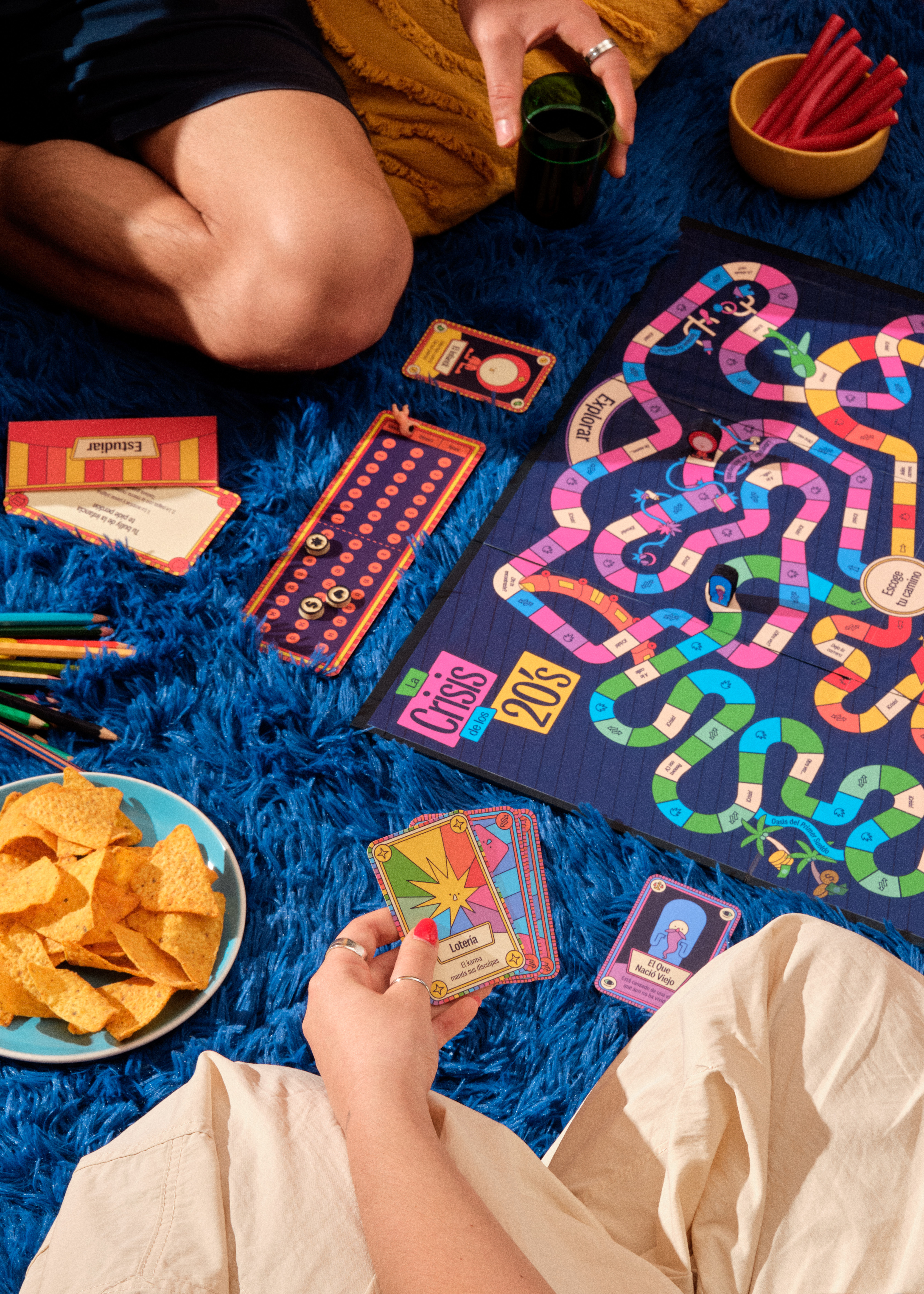
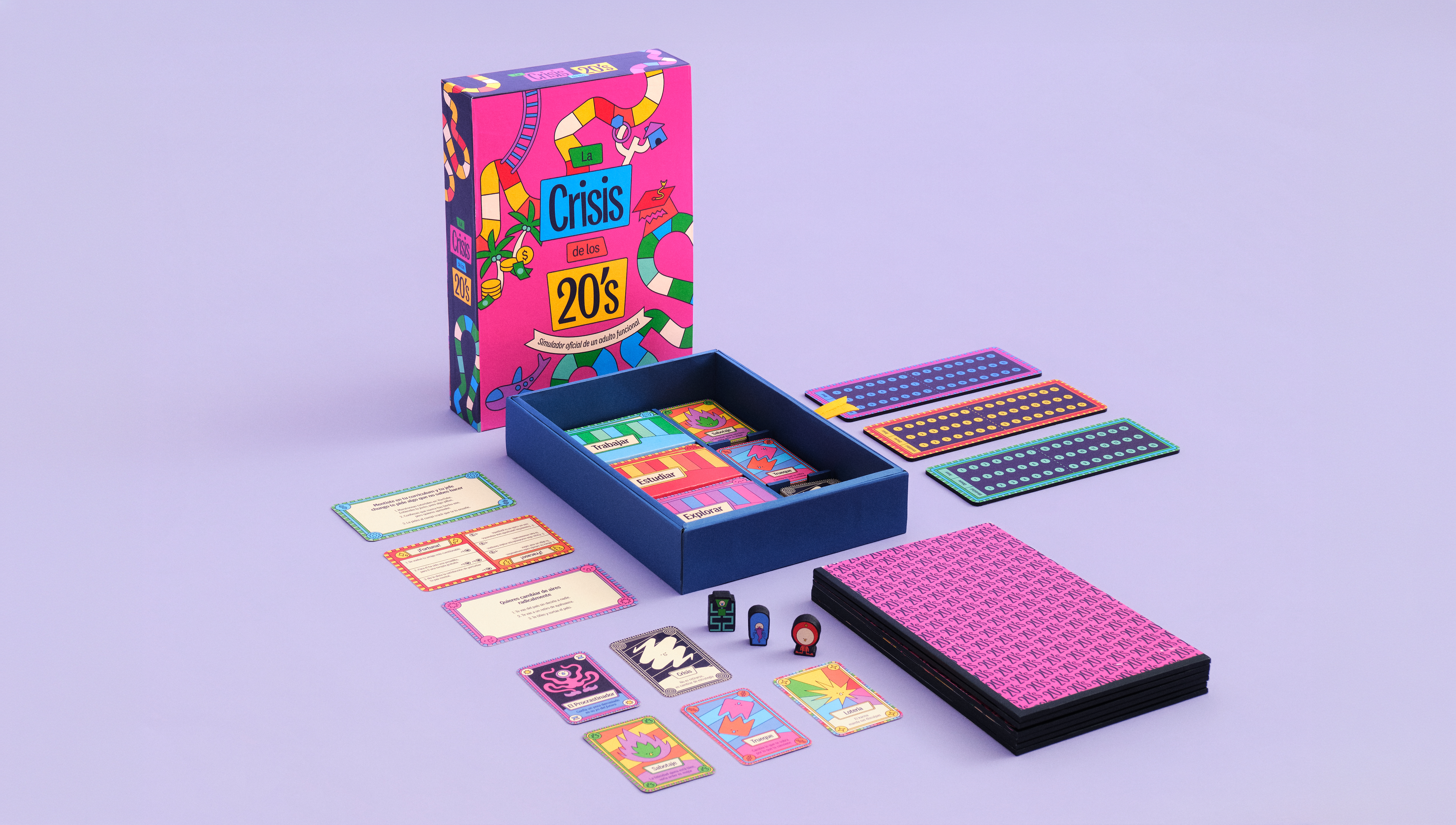


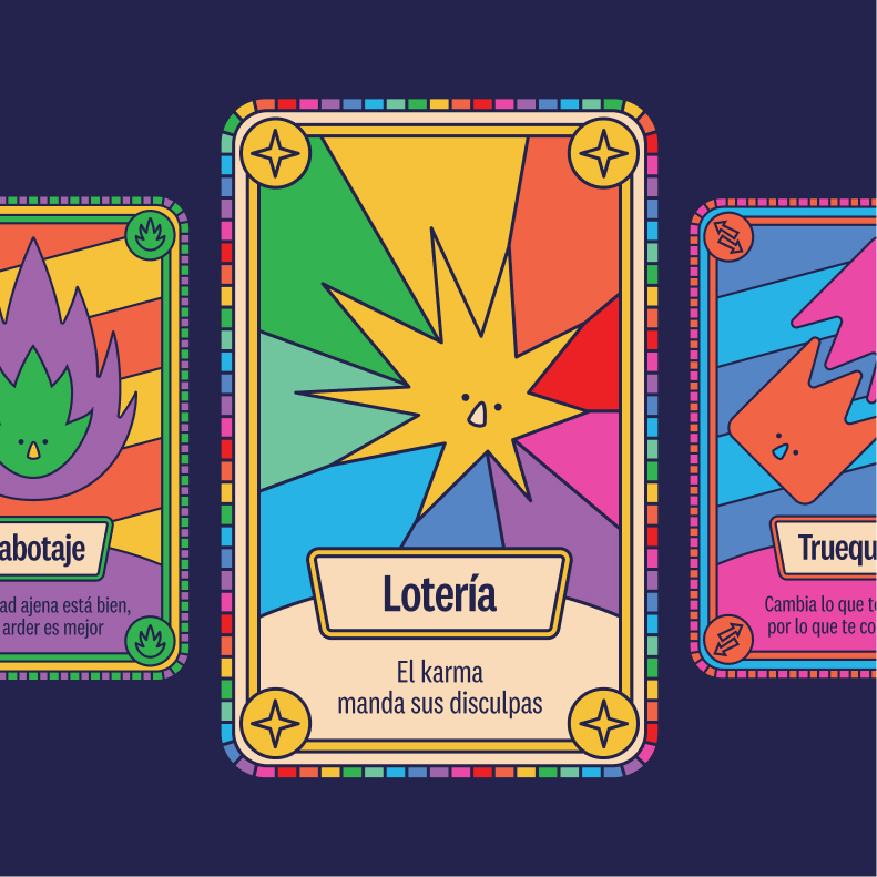
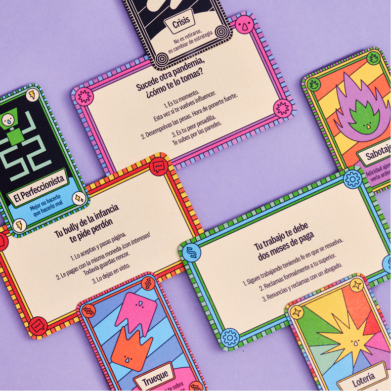

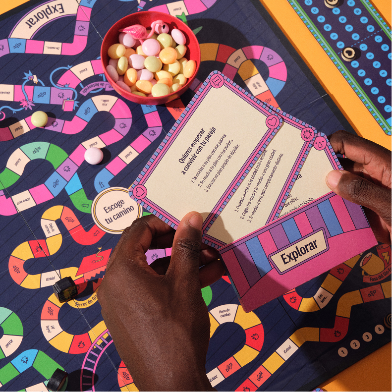
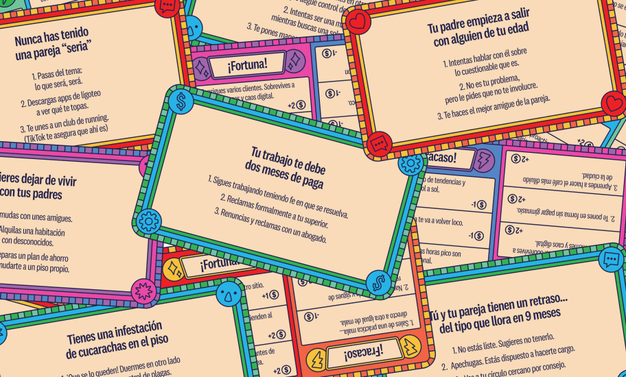
48 special game cards, 66 decision game cards, 6 character tokens, 6 life boards, and one board.
To tell the game cards apart and guide players visually, I created a design system based on the tile patterns and color palettes of the different paths, along with a symbol for each of the game's three point types: money, love, and identity.
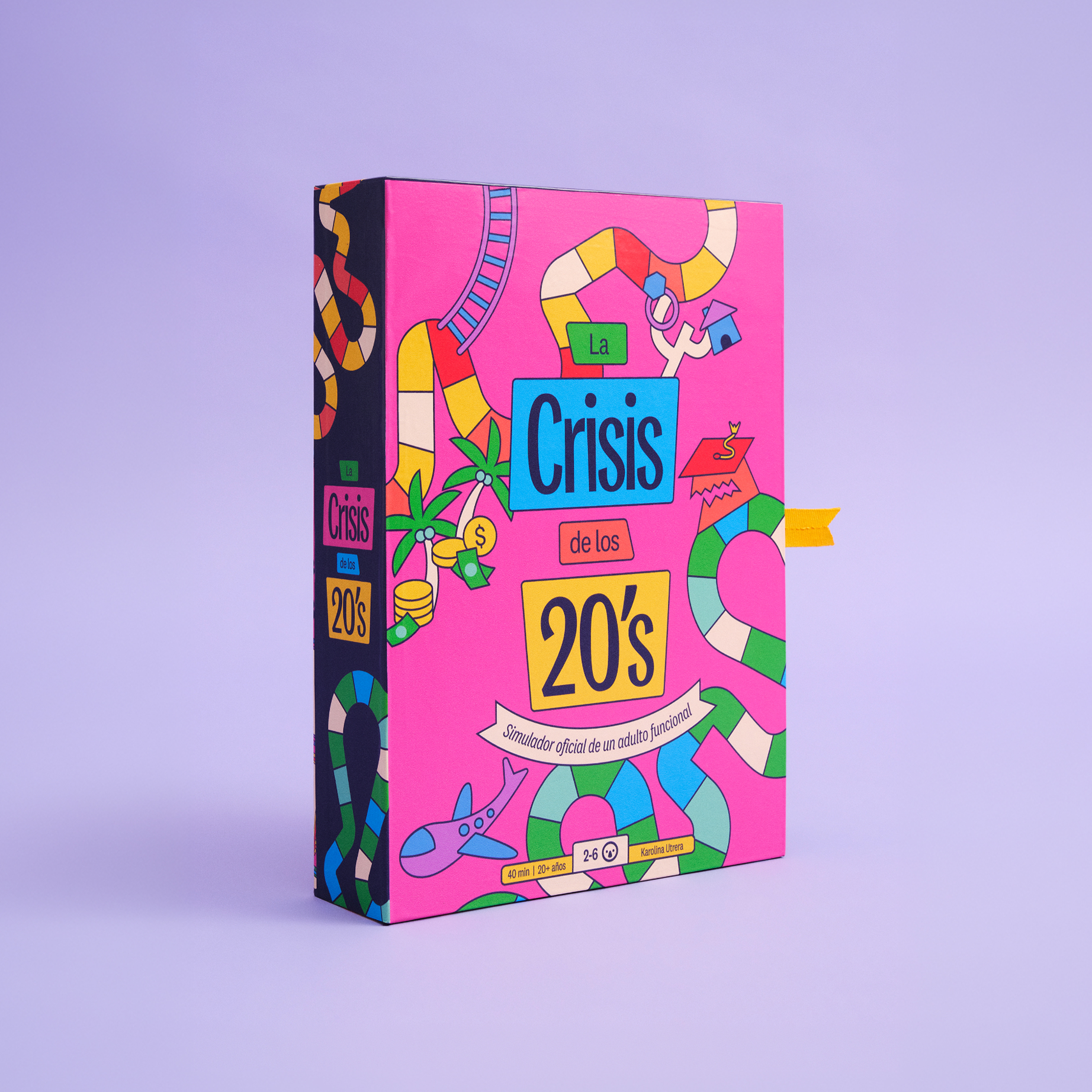
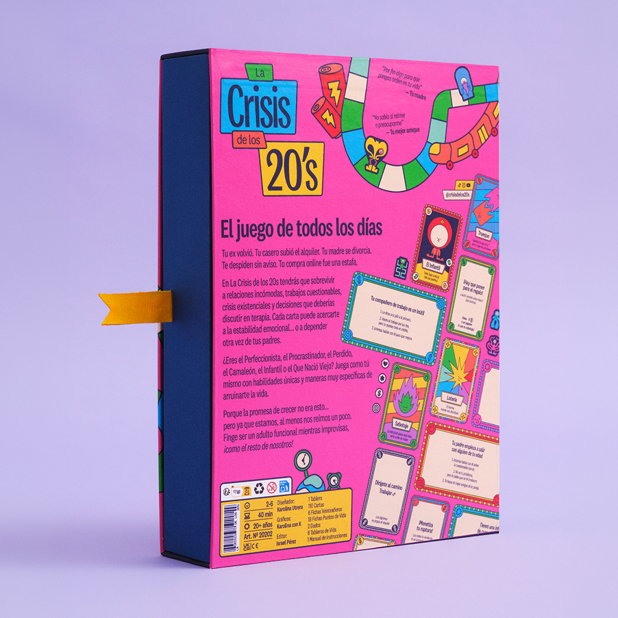
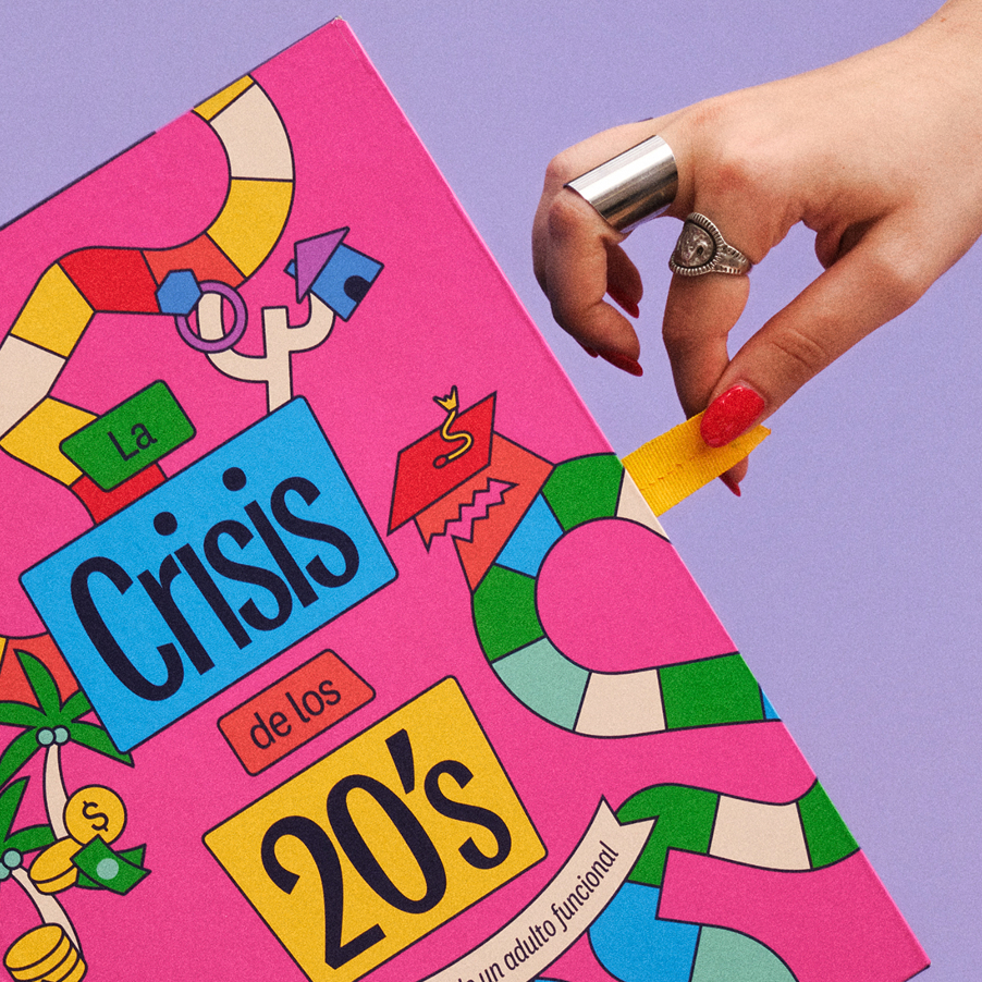
The packaging is a side-opening drawer box: a cardboard sleeve wrapped in matte vinyl and a cardstock-lined tray with a ribbon pull. Inside, a cardstock insert made of three overlapping pieces leaves finger gaps for lifting out each element, and the pieces rest loosely in it instead of being fitted into place.
Credits
Tutors:
Mireia Ruiz, Anna Bosch, Estefanía Aragüés, Bea Salas, Ona Navinés, Carme De Miquel.
Photography team:
Adrián Padilla @ps_adrian, Gabriela Bermúdez @10grb, Marta Subimar @subimar.
Prototype production:
Ateneu de Fabricació Digital de Les Corts.
Client:
IDEP Barcelona.

numen
kos